Weather App Redesign
Role: Graphic Designer
Tools: Figma
Duration: September 2020 - December 2020
Summary
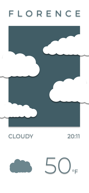
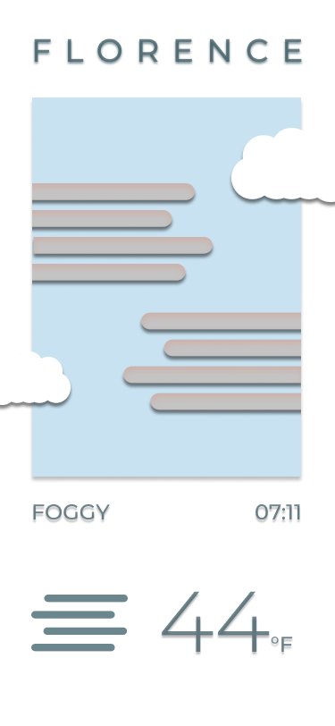
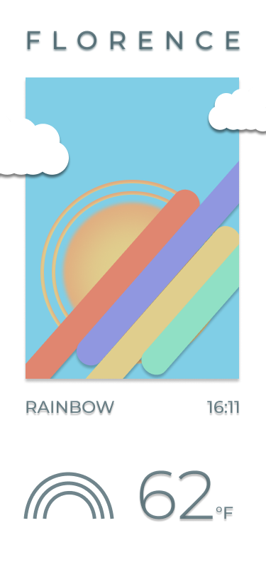
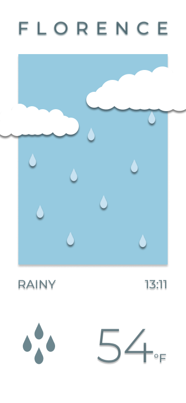
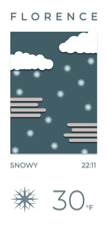
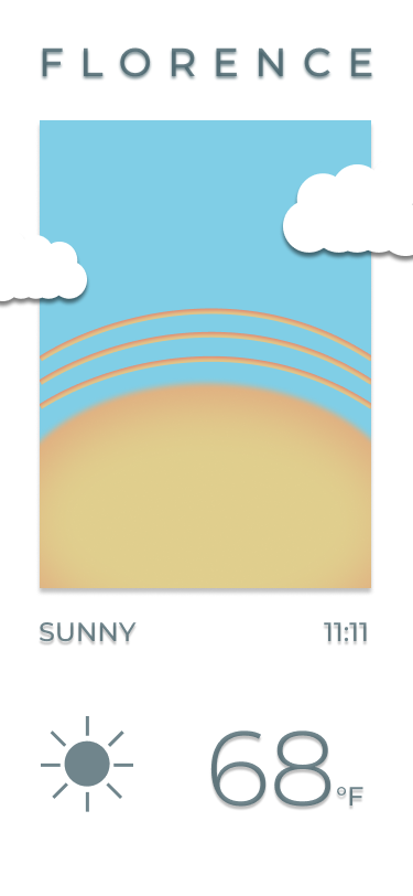
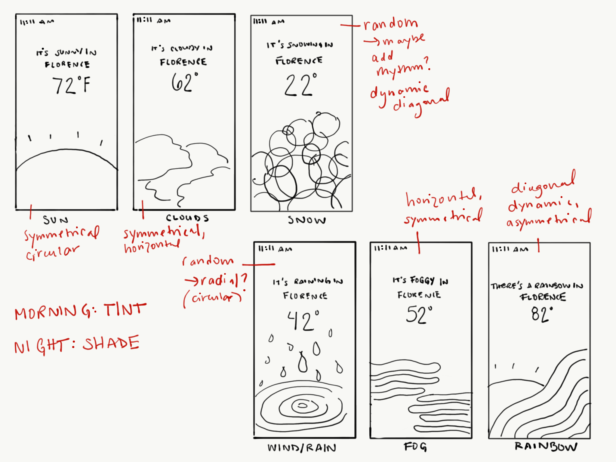
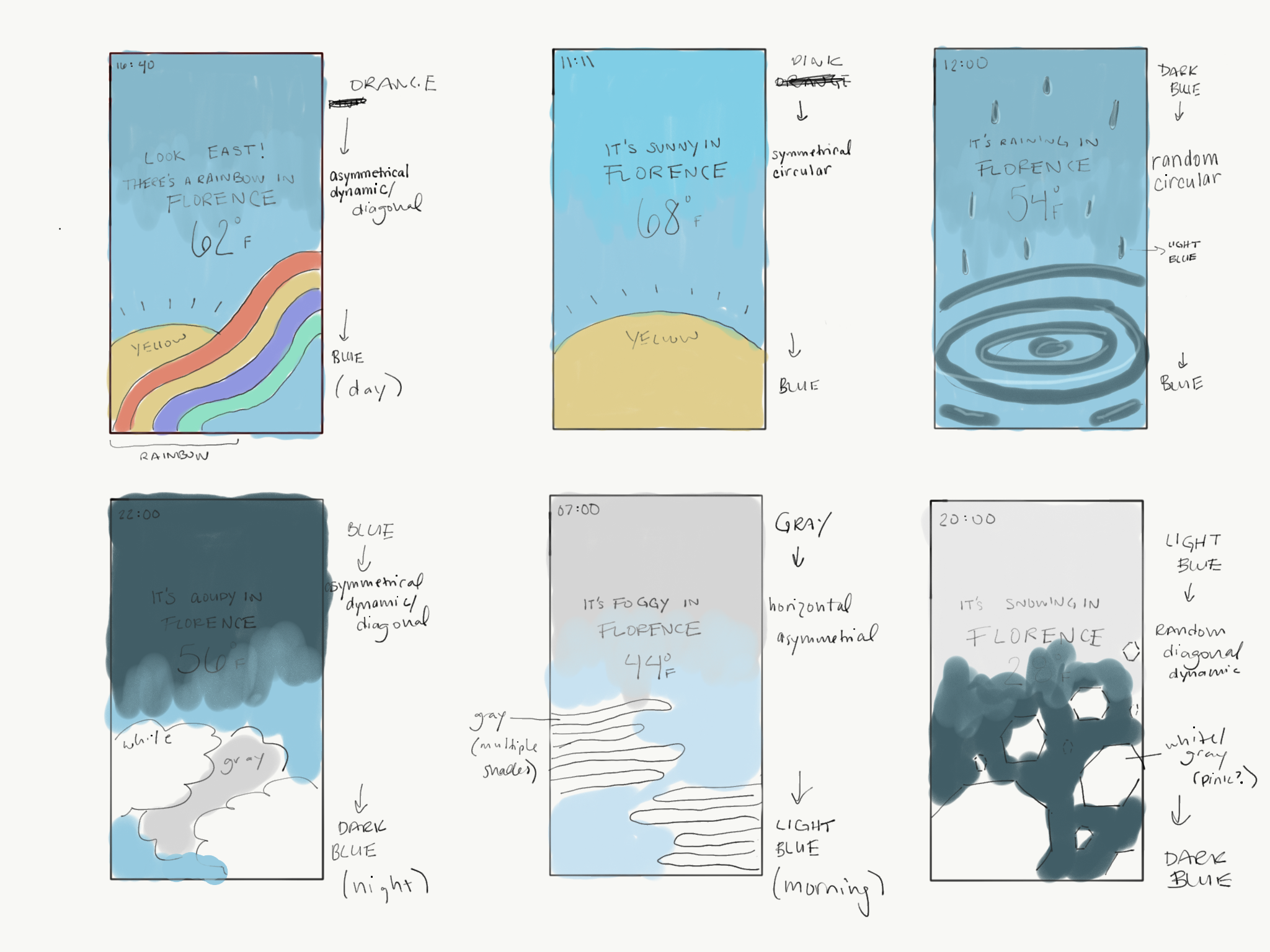
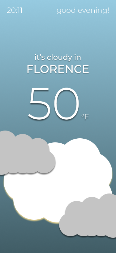
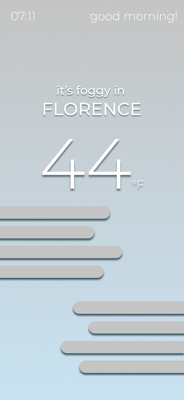
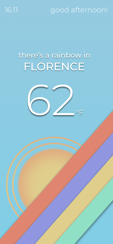
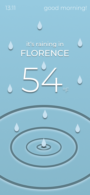
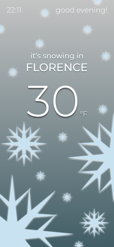
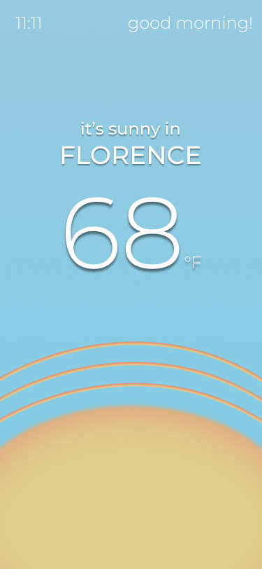
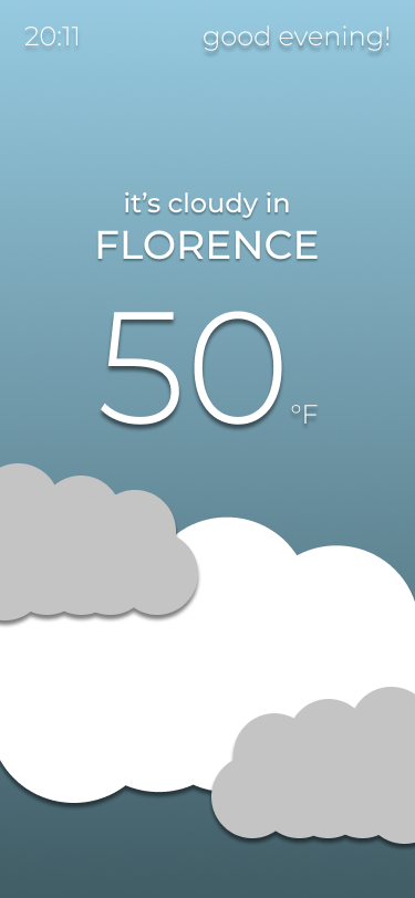
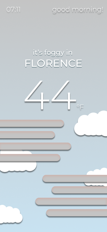
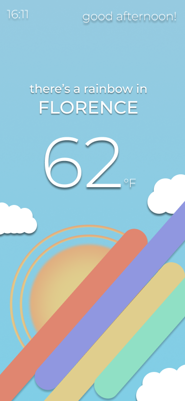
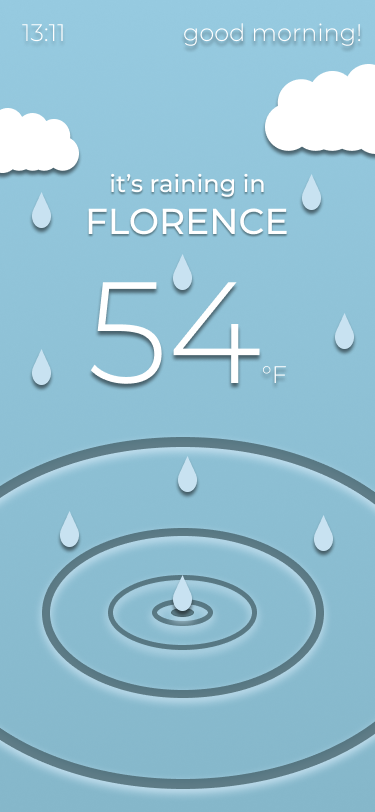
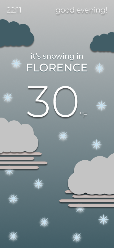
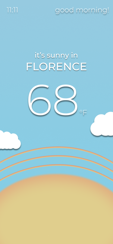
As a project in my graphic design class, SI 320, I was tasked with creating a minimalistic, geometric deisgn for a weather app. I designed six screens with six different weather conditions at various times of day - morning, middday, afternoon, and night. I completed this design using Figma, and focused on devloping skills in color selection and composition using Gestalt principles.
Design
I experimented with color and compositon to create geometric designs that also had a bright and whimsical feel. My intention was to include large, solid, colorful shapes that were slightly cartoon-ish, but effectively expressed the time of day and weather state. I wanted the weather conditions with precipitation to be dynamic and random, and I wanted to include continuity in each screen.
Implementation
I used Figma to design these screens. I began with the most simple screen, which was sunny weather, first, and worked from there. As I familiarized myself with this workspace, I discovered a lot of useful features, and noticed where Figma was lacking in comparison to Illustrator.
Feedback & Edits
In class, I recieved feedback from my instructors and peers about how I could improve my project. The most valuable feedback I recieved was to think more about what design features I could turn into patterns and use in more of the screens to create a more cohesive design. I took that advice and included more clouds, rounded rectangles, and generally organic shapes to tie my designs together into one weather app.
At the end of the semester, I reviewed all of the material I made in SI 320 and made notes of what I'd like to improve upon. I wasn't satisfied with the overall feel of the screens side by side and wanted to redesign them yet again in a way that felt more cohesive. I wanted it to be very obvious that all of the screens belonged together. I also felt as though I could simplfy the designs more. The overall feel was less minimalistic than I originally intended, and I made no use of icons because we had not yet studied those in class. My final design includes illustrations of the weather states in addition to simple icons representing the weather states, and the structure of each screen is more contained and features more white space and negative space.