Long-Scroll Website Mockup
Role: UI Designer
Tools: Illustrator, Photoshop
Duration: November 2020 - December 2020
Summary
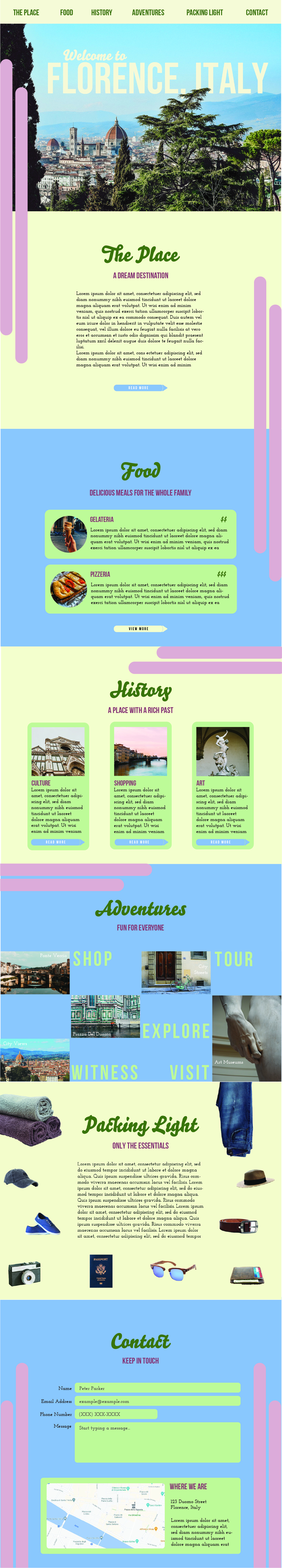
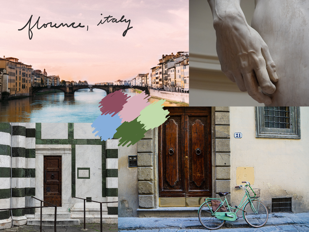
I was tasked with creating a user interface for my final project in my graphic design class, SI 320 about one of my favorite places. I was given the section topics and content to be included, and my tasks were to create a layered collage of text
and a related image of my chosen location, a collage with random balance of common vacation items to pack, another collage using a modular grid, and to develop useful UI elements to use throughout the site including a contact form, map, and
buttons. As designers, it is imperative that we are constantly keeping the user in mind. It is my job to highlight the features of Florence to appeal to this specific audience.
Who is (theoretically) going to use this website?
World travelers who are interested in visiting Italy, and specifically, the city of Florence. They could be interested in the art, food, or religious culture.
Inspiration
I began finding inspiration by searching for images related to my favorite place - Florence, Italy. I visited Florence in 2016 and fell in love with the city. I collected a few of my favorite images online of scenes from Florence and constructed
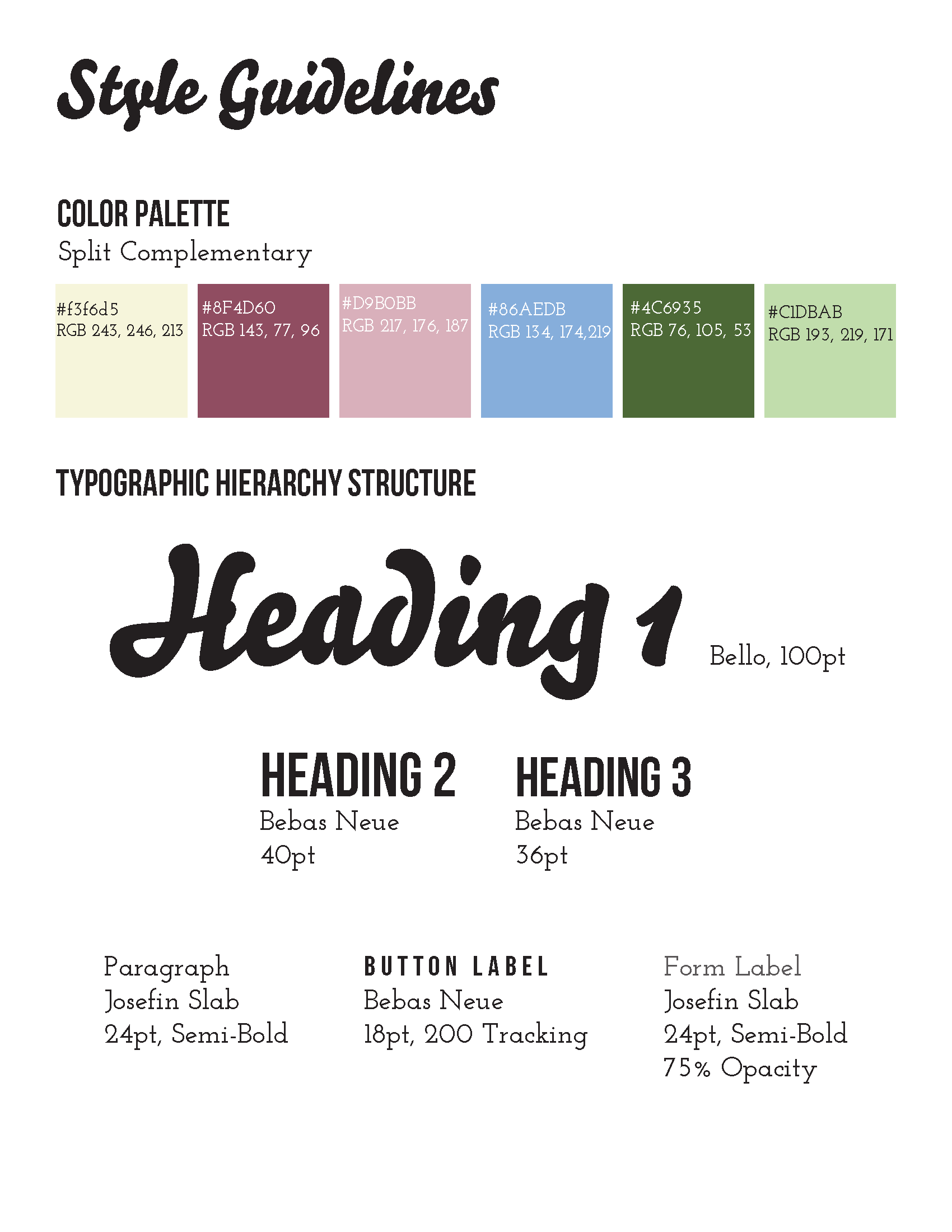
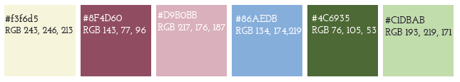
my color harmony based on the images I liked the best. Because of the iconic design of the Cattedrale di Santa Maria del Fiore in the center of the city, my color scheme was based on the green that dominates the ornate cathedral. I selected
a split complementary color harmony that was colorful and lively. I wanted my desktop site design to be energetic and colorful while still being accessible and easy to read for all. Next, I created a typographic solution. I incorporated script,
sans-serif, and serif typefaces for the headings, subheadings, and body text respectively.
Implementation
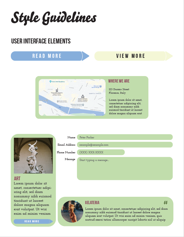
While the focus of this project was creativity and visual pleasure, I wanted to ensure this site would be easily accessible for all users if it were to be made into a functional prototype. The components were designed with this focus in mind, providing clear actions for users to take when clicking on buttons and filling out forms.
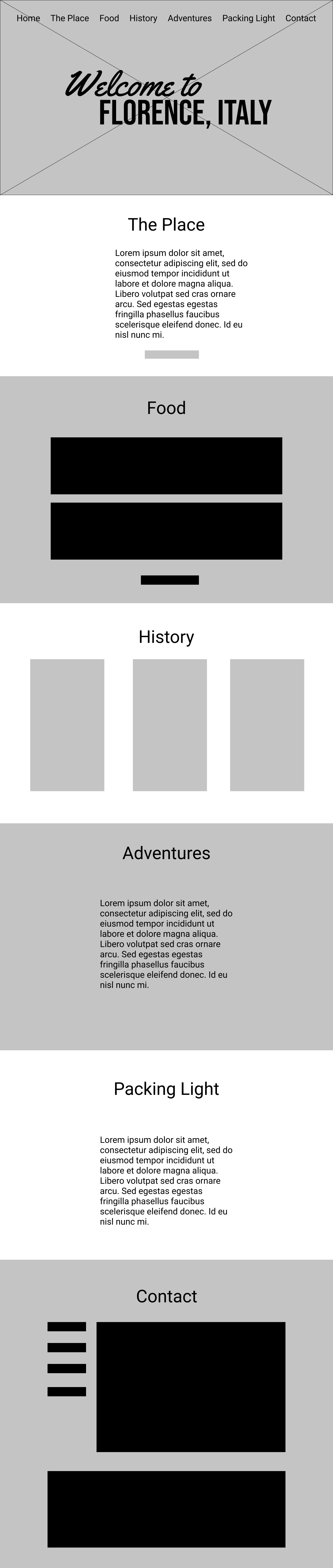
Following the design of color harmonies and typographic elements, I began working on the challenge items: creating three collages and a unique yet functional set of UI elements. Finally, I combined each of these elements into the final layout, following the structure of the provided wireframe.
Displayed below are the typographic and color solutions for this digital product, as well as the individual user interface components that would be used within the site. These UI components included content teasers, contact forms, buttons, and maps.